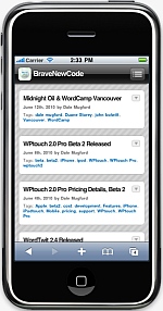
New Blog Interface for Smartphones
I’ve installed a plug-in called WPtouch, which adds a “mobile interface” for visitors who use a touch-based smartphone (such as an Apple iPhone, Google Android, or Palm Pre).
 As an iPhone user, I sometimes find it annoying to navigate through web sites (including my own blog) which were designed with a standard desktop screen in mind. On the other hand, I also sometimes find it annoying to experience a “crippled” version of a web site just because I’m using an iPhone.
This plug-in also gives users the option to disable the “mobile view” (just scroll to the footer and click on the toggle switch to disable (or re-enable) the mobile view).
There are many “settings options” for this plug-in, and I’m still experimenting with some. I’m currently using the free version, but will likely upgrade to the Pro version ($29) once I figure out how to use some of the features.
Let me know what you think.
Hello – I disabled the feature to show the difference between the mobile site and the actual site but can’t for the life of me work out how to re-enable again – there isn’t that nice slider at the bottom of the website -any suggestions?!
Sarah, when I view the regular site from my tablet, and scroll to the bottom of the page, I see a large box containing the words “Mobile Theme” and a toggle switch (which is “off” when viewing the regular site).